Multimedia Design

Multimedia Design

Design for Non-Designers: Getting Started with 3 Core Principles

Home About Services Our Works Rates Connect Blogs Humberger Toggle Menu Design for Non-Designers: Getting Started with 3 Core Principles September 9, 2024 Many people have products and services they want to share with the world, but not everyone has the opportunity to collaborate with specialists. Designing for social media and other marketing materials is essential to reach a wider audience and educate them about your brand. While working with an expert is ideal, there are effective ways to handle the design process on your own. Yes, even if you’re a non-designer! Don’t be intimidated—simply start with these 3 C’s to get you on the right track. Don’t forget to COMMUNICATE …because that’s the purpose of posting! Make sure every post is created for a purpose. So, before you start designing, write down what you want to communicate with your post or material. Take the example below for instance. The post intends to sell a look that their clothes capture. This gives the clothes more relevance to the viewer since it is easier to relate and feel excited now that there is a well-communicated message in the post. PLAINS AND PRINTS Source: https://www.instagram.com/p/C7MISRpLyLI/?img_index=1 Stick to a COMPLEMENTARY COLOR SCHEME In addition to ensuring your designs look polished and professional, using a predefined approach will save you considerable time and effort in choosing colors and layouts. Unsure where to begin? Start with your brand palette as a foundation and build from there. This strategy not only maintains brand consistency but also simplifies the design process, making it less daunting. For example, let’s take a look at these well-known brands:   CLINIQUE Source: https://www.instagram.com/p/C5yHks5Lb2y/ STRAIGHTFORWARD Source: https://www.instagram.com/shopstraightforward/reel/C6I-8P_vvx9/ Make it CLEAN Similar to a well-designed room or neatly put-together outfit, people are naturally drawn to uncluttered design. Heavily designed works have its appeal as well, but for beginners or people who are only starting in design, it’s better to stick to a clean approach. For example, let’s take a look at these brands: PRADA Source: https://www.instagram.com/p/C7B0_y5gjdM/ STRAIGHTFORWARD Source: https://www.instagram.com/p/C6_CirFp9-3/ Don’t rush the process. Take your time to learn it. It’s better to post at a slower pace with consistency than to rush the process and compromise the quality. Here are some free online tools you can check out to help you get started: https://www.canva.com/en_ph/ https://www.figma.com https://www.creativefabrica.com/ Need an expert’s advice? Shoot us an email. We’re here for you! Happy designing and have a great rest of the week! Unlock weekly marketing insights from Your Monday Mentor Your Monday Mentor is a weekly newsletter by BrandSpeakAsia, offering executives and decision-makers targeted insights and motivational content on marketing strategies and industry trends to kickstart their week. Subscribe You have been successfully Subscribed! Ops! Something went wrong, please try again. Book a consultation FREE FOR 30 MINUTES Send an email to deniece@brandspeakasia.com SIGN UP TO OUR NEWSLETTER Scan QR JOIN OUR TEAM CAREERS AND INTERNSHIPS Send an email to shai@brandspeakasia.com © 2024 BrandSpeakAsia. All rights reserved Developed by GLAXIT Follow our socials

Multimedia Design

Translating Your Brand into a Visual

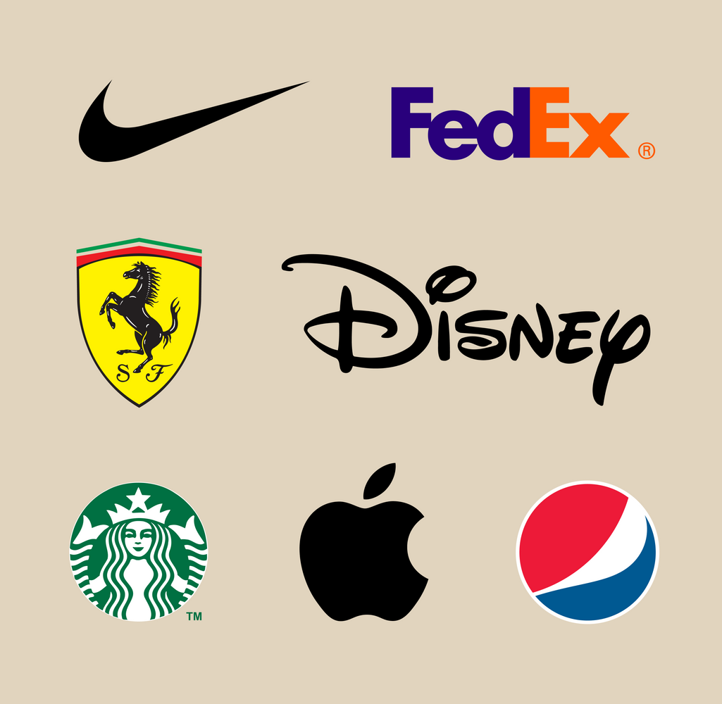
Home About Services Our Works Rates Connect Blogs Humberger Toggle Menu Translating Your Brand into a Visual How it can make yours stand out! September 5, 2024 In a sea of competition how do you make your brand or service stand out? It may be a good one that people like, but how will people know about it? One tried and tested method is through your brand’s visual. A great and consistent visual generates brand recall and establishes the identity that you are trying to communicate to your target audience. Let’s take time to learn and recall what exactly makes excellent visuals and how you can craft ones that will help you in your business’ goals. Source:https://unsplash.com/photos/printed-sticky-notes-glued-on-board-zoCDWPuiRuA?utm_content=creditShareLink&utm_medium=referral&utm_source=unsplash Go back to your brand identity It may have been mentioned thousands of times, but we will say it again because it’s one of the most important things. Before doing any visual execution or effort, first establish your brand’s identity— meaning its audience, voice, and personality. What would my brand be if it were a person? Is my brand fun and playful? What are my brand’s interests? Who is my brand talking to? Mastering this information will make the process so much more clearer and meaningful.  Start with the basics Your logo is the primary visual image of your brand. Iconic ones in the world include Lego, Coca-Cola, Ford, and Toyota. A common factor of all of these logos are its cleanliness, catchiness, and aesthetic appeal. Elements of a good logo include colors, shape, and simplicity. It makes them easy to recall as well as opportunities for engagement.   Tappi.org discusses a study where 92.6% surveyed by the CCI: Institute for Color Research said that color was the most important factor when purchasing products. So, carefully decide which ones reflect your brand the best. Afterward,  you can get creative with things like contrast, hue, etc., when you start doing your communication materials. Source: https://www.designrush.com/agency/logo-branding/trends/brand-visual-identity Some of the world’s best logos according to some design and marketing experts: Source: https://www.frontify.com/en/blog/the-best-logos-of-all-time-ever/ Source:https://unsplash.com/photos/silver-laptop-computer-with-assorted-logo-screengrab-ubIWo074QlU List it down To guide you in your visual journey, create a style guide for your brand, including important parts of your brand: color palette, typography, logos, messaging guidelines. Consistency is key, but don’t be afraid to play and be creative! Picture yourself walking inside a mall or stuck in traffic. Which logos catch your attention the most? Study what makes their appeal that way and it will open your eyes to all sorts of possibilities in executing your brand’s visual. We hope you enjoyed our discussion this Monday! Please stick around for more! This is your Monday Mentor wishing you a good week ahead! For more information on this topic, don’t hesitate to contact us. Unlock weekly marketing insights from Your Monday Mentor Your Monday Mentor is a weekly newsletter by BrandSpeakAsia, offering executives and decision-makers targeted insights and motivational content on marketing strategies and industry trends to kickstart their week. Subscribe You have been successfully Subscribed! Ops! Something went wrong, please try again. Book a consultation FREE FOR 30 MINUTES Send an email to deniece@brandspeakasia.com SIGN UP TO OUR NEWSLETTER Scan QR JOIN OUR TEAM CAREERS AND INTERNSHIPS Send an email to shai@brandspeakasia.com © 2024 BrandSpeakAsia. All rights reserved Developed by GLAXIT Follow our socials

Multimedia Design

How to Bring and Consistent and Strong Brand Experience To Your Consumers

Home About Services Our Works Rates Connect Blogs Humberger Toggle Menu How to Bring and Consistent and Strong Brand Experience To Your Consumers September 3, 2024 How do you get your market to patronize your brand? First things first, you have to be able to connect to them and send them a message. Reaching your audience and giving a positive experience in a cluttered landscape is definitely a challenge, but it is also an opportunity to be more creative and strategic in your efforts. To establish a message and make an impact, the brand must be clear, strong, and generate recall. A good, solid message stems from a solid brand. Work on your brand first, and then make sure that every effort that comes after it is consistent with it. Source:https://unsplash.com/photos/printed-sticky-notes-glued-on-board-zoCDWPuiRuA?utm_content=creditShareLink&utm_medium=referral&utm_source=unsplash Define the pillars of your brand To communicate a clear and concise message you must first be a master of your brand’s identity. This consists of your brand’s purpose, vision, values, voice, personality, and positioning. This is the core of the brand, where everything else should come from. In short, these are the roots of the brand. The stronger they are, the clearer your brand will be. Form the visual elements of your brand Based on your brand identity, craft its image.  By this, we mean the fonts, logo, color palette, and market personification. These should reflect back to what your brand is all about. Examples of brands that have strong visual elements are Starbucks, Nike, Coca-Cola, Apple, and McDonald’s. In fact. Nike’s checkmark is so iconic, people recognize it even without the brand name. Apple, on the other hand, knows its visual voice to a tee that even if they do a logo refresh, the market is still able to connect with it and recognize the brand.  Source: https://unsplash.com/photos/a-man-holding-a-cup-of-coffee-and-some-snacks-gwNAgJqeAUo?utm_content=creditShareLink&utm_medium=referral&utm_source=unsplash Source: https://unsplash.com/photos/blue-ballpoint-pen-on-white-notebook-ZSPBhokqDMc Map It Out We have finally arrived at the stage of figuring out our customer touchpoints or  the different stages, channels, and moments that your customers encounter  before, during, and after experiencing your brand. You can segregate these into your online and offline touchpoints. For online, these may include your socials, direct email marketing, and your website. On the other hand, offline may include your sales personnel, billboards, flyers, store, etc. Every moment that a consumer experiences can either  make them engage further with your brand or it can also drive them away. The more consistent, strong, and appealing the experience is, the more it will attract people towards your brand. This can either lead to a sale, a repeat purchase, a brand engagement, or  it can further their interest to know more about your brand. This caps up this week’s edition. Thank you for joining your Monday Mentor today! We hope you enjoyed learning and re-learning with us. Remember to keep it intact. Stay strong and true to what your brand stands for and its identity will strengthen even further in the minds of consumers as they continue to experience it. Have a good week everyone! Unlock weekly marketing insights from Your Monday Mentor Your Monday Mentor is a weekly newsletter by BrandSpeakAsia, offering executives and decision-makers targeted insights and motivational content on marketing strategies and industry trends to kickstart their week. Subscribe You have been successfully Subscribed! Ops! Something went wrong, please try again. Book a consultation FREE FOR 30 MINUTES Send an email to deniece@brandspeakasia.com SIGN UP TO OUR NEWSLETTER Scan QR JOIN OUR TEAM CAREERS AND INTERNSHIPS Send an email to shai@brandspeakasia.com © 2024 BrandSpeakAsia. All rights reserved Developed by GLAXIT Follow our socials

Multimedia Design

How to Construct the Perfect Thumbnail

Home About Services Our Works Rates Connect Blogs Humberger Toggle Menu Getting that Click How to Construct the Perfect Thumbnail August 30, 2024 The growing competition between social media platforms is a daily battle for brands like yours. As the market evolves, trends are challenging companies to up they game to get their audience engaged. Someone once said, “Engagement is the heartbeat of any successful social media campaign, and videos are the rhythm that gets hearts pumping.” Imagine you’ve made the perfect video. Now how do you get people to click it? The simple rule (of thumb) is in creating a creative thumbnail and here are some tips to nail it (pun intended): Source: https://unsplash.com/photos/man-in-grey-shirt-using-grey-laptop-computer-7d4LREDSPyQ Engage the eyes Research suggests that in 2023, the average social media attention span of a user is at 1.5 seconds only! Yup, we’re as surprised at first as you are. With this in mind, you need to utilize the power of relevant and creative imagery with the colors, elements, and font faces that give your audience a preview of what your video is all about in 1.5 seconds or less. The starker the thumbnail, the more chances a viewer will make that click. Consider this checklist: Does it trigger an emotion? Is it worth the curiosity? Does it capture your video’s story? Make it catchy In relation to this, keep your in-artwork text short and sweet. This will send your message quickly and also make it stickier for the one who reads it.  On a technical note, using highly-searched keywords will improve the searchability of your video, so take time to know  which ones you can use to make a social media network’s algorithm work for you. Also,carefully decide when to use ALL CAPS, in order to utilize its impact. Source: https://www.pexels.com/photo/love-is-all-you-need-signage-788662/ Source: https://tinyurl.com/ycyazede Maintain brand consistency Almost done and excited to upload? Don’t forget to review. Everything done should be consistent with your brand. Go back to the components of your brand like identity, design, voice, and tagline. Think of a theme or a look which you can apply in your channel’s thumbnails, while still maintaining excitement and appeal for each one. Unlock weekly marketing insights from Your Monday Mentor Your Monday Mentor is a weekly newsletter by BrandSpeakAsia, offering executives and decision-makers targeted insights and motivational content on marketing strategies and industry trends to kickstart their week. Subscribe You have been successfully Subscribed! Ops! Something went wrong, please try again. Book a consultation FREE FOR 30 MINUTES Send an email to deniece@brandspeakasia.com SIGN UP TO OUR NEWSLETTER Scan QR JOIN OUR TEAM CAREERS AND INTERNSHIPS Send an email to shai@brandspeakasia.com © 2024 BrandSpeakAsia. All rights reserved Developed by GLAXIT Follow our socials

Multimedia Design

The Power of Concepts and Visuals​

Home About Services Our Works Rates Connect Blogs Humberger Toggle Menu How to Tell a Compelling Story The Power of Concepts and Visuals August 30, 2024 Visuals. It’s a powerful thing that makes an audience remember around 80% more than if it were just text characters. Having said that, they have to be meaningful, relevant, and engaging. They have to tell a story. How does this affect your brand? It’s not just having well-done visuals; it’s about creating a story that makes an impact. Writing and designing an informative, engaging, and positive experience that can ultimately benefit your brand through sales, recall, referrals, or even brand loyalty. Let’s start with Step One. Developing what to tell. Source: https://unsplash.com/photos/person-lettering-on-tracing-paper-using-mechanical-pencil-o2TRWThve_I Crafting a Story It all goes back to knowing your target audience. What are their interests? What makes them happy? What resonates with them? From there, you can brainstorm what kind of approach to  use. Remember to be authentic because people will most likely gravitate to something that is genuine. Another tried and tested method of making a compelling  story is using a relatable emotional angle. How you feel is something you don’t easily forget. This will generate more recall, and in relation to your brand’s objectives,  more results. Keeping it Simple While the backend method of crafting a story is complex, how you tell your story should be simple, but impactful. This gives it the strength to cross through all the noise, completion, clutter, and into the minds of a consumer, An iconic brand execution is Nike’s line, “Just do it”, which is relatable in a lot of ways, specifically for driven professionals, students, and athletes who are pursuing a goal or a dream. It is  also short enough to recall and has a definite ring and appeal to it  — similar to the effect of a catchy song chorus! Source: https://x.com/nikebasketball/status/760173432180908032 Source: https://visme.co/blog/visual-hierarchy/ Designing The Visuals To Tell The Story Now, how do you convert your story into a visual that can generate results? Merge it with a strategic visual. Have fun composing it, noting their alignment, grouping, proximity, and harmony.    In the advertisement on the right, it utilizes left alignment and a bold font to communicate the message. Source: https://balsamiq.com/learn/articles/visual-hierarchy-and-alignment/ Take into consideration your visual hierarchy. This means knowing which visual should have the most real estate. Is it the fonts or the image? Finally, make sure your typography, voice, and color are consistent with your brand—and then decide how you can play with it.  Red, for example, is known to get the attention of an audience. On the other hand, contrasting colors can also have the same effect. Note also that visual doesn’t have to mean it focuses on imagery, sometimes, your text can also have a powerful impact when you play your visual cards right.  A great example of this is Mastercard’s Priceless Campaign. It tells the story of an important aspect of people’s lives: the desire to have control over their lives so that they may enjoy them. Everyone wants to be happy and relish the great things in life. The team behind Mastercard discovered during that time that Mastercard could actually transact in more places compared to Visa and decided to use this seed of an idea for a campaign that would eventually be one of the great ones. Source: http://www.pausacreativa.es/blog/wp-content/uploads/2014/03/priceless.jpg Conclusion: This caps up our discussion on visual storytelling (for now!). Remember to keep it and your aesthetics simple, relevant, and impactful. The online world has free visual suites like Canva, Visme and Adobe Express where you can begin your creative journey. We hope you enjoyed the discussion as much as we did! If you want to talk more about it, feel free to contact us! See you again next week for another dose of Monday Mentor mental stimulation to go with your favorite coffee! Unlock weekly marketing insights from Your Monday Mentor Your Monday Mentor is a weekly newsletter by BrandSpeakAsia, offering executives and decision-makers targeted insights and motivational content on marketing strategies and industry trends to kickstart their week. Subscribe You have been successfully Subscribed! Ops! Something went wrong, please try again. Book a consultation FREE FOR 30 MINUTES Send an email to deniece@brandspeakasia.com SIGN UP TO OUR NEWSLETTER Scan QR JOIN OUR TEAM CAREERS AND INTERNSHIPS Send an email to shai@brandspeakasia.com © 2024 BrandSpeakAsia. All rights reserved Developed by GLAXIT Follow our socials

Scroll to Top